Bright abstract dinnerware collection

For week six of the Rise, Design And Shine course, we were asked to set our creative juices free and generally have fun with the brief. So that is exactly what I did!
The weeks have gone so fast and I’m really enjoying the course. I’ll have a few more quality pieces to add to my portfolio when the course is done. Week six was about abstract experimentation, for which we could get inspiration from either our emotions, the seasons or one or more objects. I love shapes, therefore my bright, abstract dinnerware collection was conceived from metamorphosis.
I created a few doodles to get me started, then I selected one of the ideas and developed in PhotoShop. I began with a few bright colours and then used softer tones of yellow, pink and turquoise to calm down the brighter shades. To contrast with these, I added flat darker tones, which really complimented the existing colours in the abstract piece; and to break up the bold, angled shapes, speckled textures and dots were positioned within them, together with a few round edged shapes.
I tend to start off with an idea, and then change & develop it as I go along. I try not to have a final outcome in mind, as I find that it restricts what I produce. Sometimes this method works really well, which is great, and other times, it doesn’t. It really is a journey of discovery. If I’m not happy with the end result, then I’ll work out a way to make it work, by selecting bits that I like and reworking them. You could say that I’m a bit of a perfectionist. Then again, aren’t most designers?
This is my first developed abstract sample. I’m pretty happy with the overall balance of colours, angles, textures and detailing.

My method for producing this piece was similar to how I created the geometric abstract sportswear patterns. This time, however, I decided to bring in more neutrals i.e. greys, creams and browns. My aim was to produce patterns which could be applied to dinnerware. These abstract patterns would look fab on picnic plates and cups for example, as well as a flask and blanket. Judging from the wonderful response I am getting on Instagram and Facebook, a lot of other people do too! A company called French Bull produce brightly coloured, abstract tableware. Their designs are so vibrant and fun, and are my aspiration for this collection.
Bright abstract dinnerware collection
Here are my plate designs. I created a few, but selected three of the better ones for the brief.


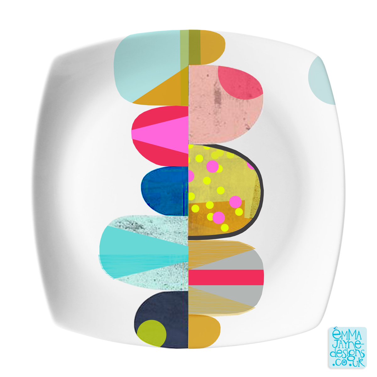
I experimented with different design layouts. Having the designs on square plates, rather than round ones gives the look a more contemporary feel. Would you agree? The designs for two of the plates are quite minimalistic, with a simple design and lots of white space. The third plate has full coverage of the design. Of the three, I think I prefer the two designs with white space the most.
Here is my bright abstract dinnerware collection. I hope you like! 😀
Emma Jayne x
September 4th, 2017 at 15:36
Is the dinnerware collection available for purchase online?
September 4th, 2017 at 16:10
Hi cupcakestudio!
Thank you for taking an interest in this ‘Abstract Dinnerware Collection’. I recently sold this range at a US trade fair, so my thoughts are that this particular design should be available in the shops soon.
Many thanks, emmajayne x